What does 'deadliest' actually mean?
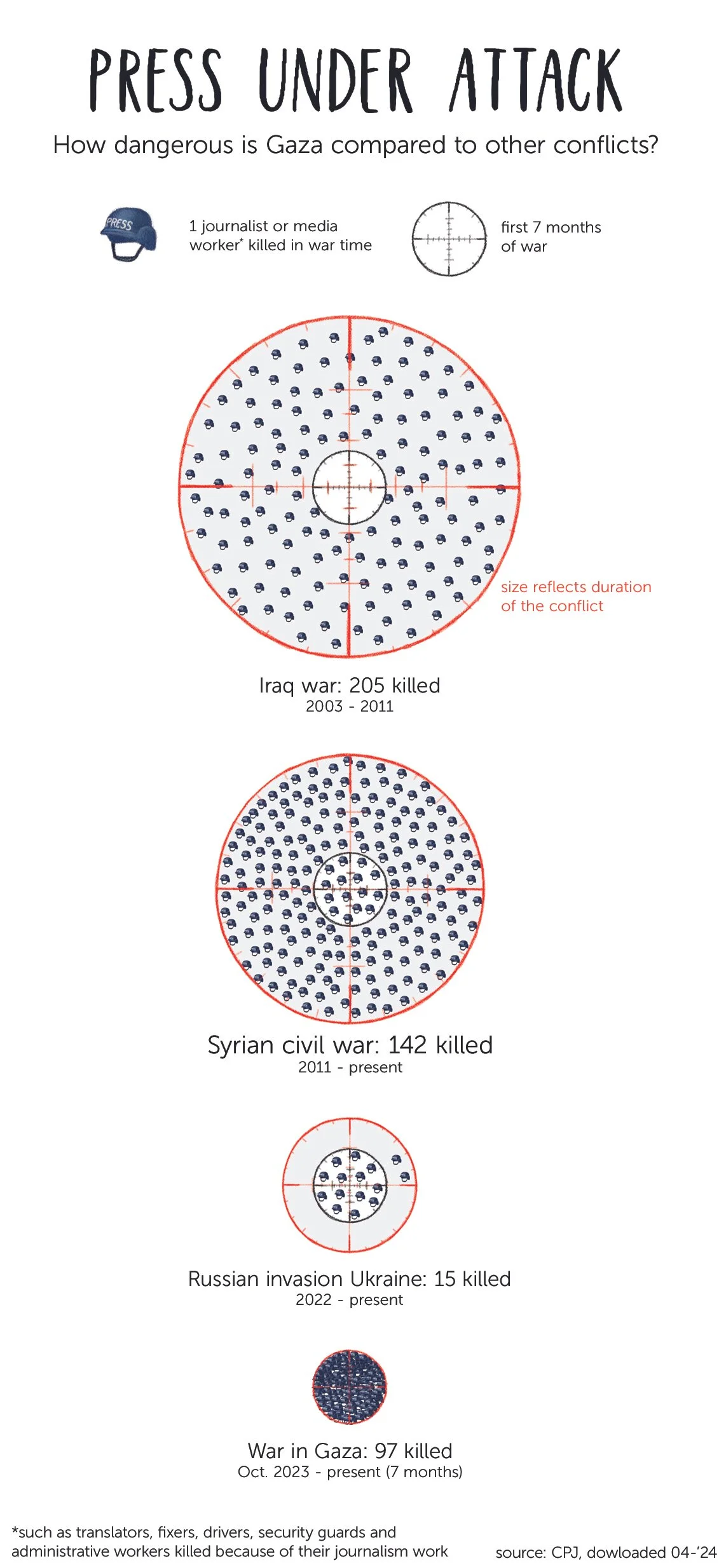
Never before have so many journalists been killed in a conflict zone as in Gaza. The CPJ database tracks press casualties worldwide from 1992 onward.
Note: This visualisation was made in April 2024, 7 months after the Hamas attacks in Israel. Data shown reflect that time period. I am writing this late 2025.
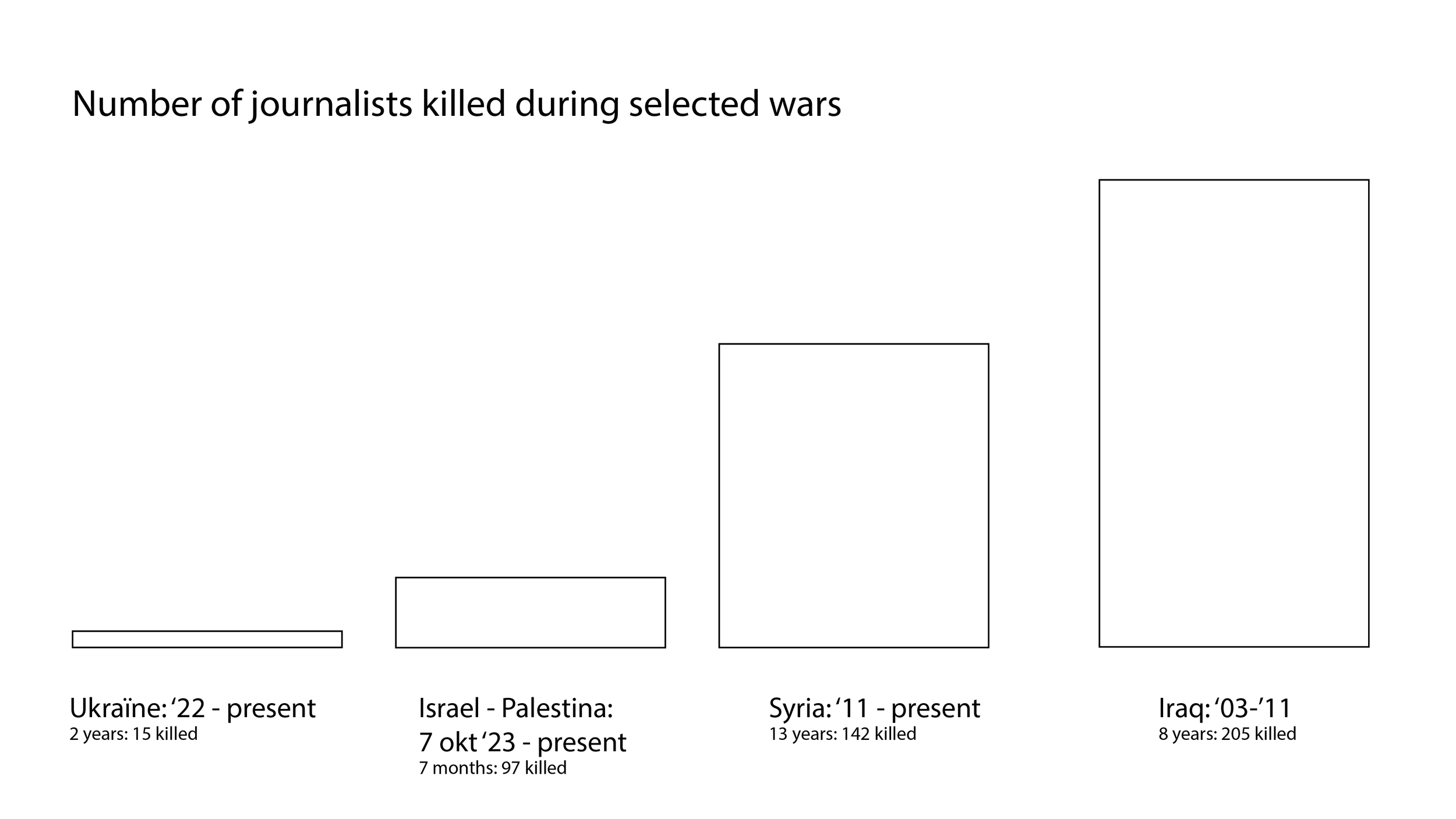
I wanted to use it to show how the current situation compares to conflicts previously labeled deadliest: Syria and Iraq. I also decided to add Ukraine to this visualisation, because the war was still intensely reported on in the Netherlands. My first instinct was a simple bar chart.
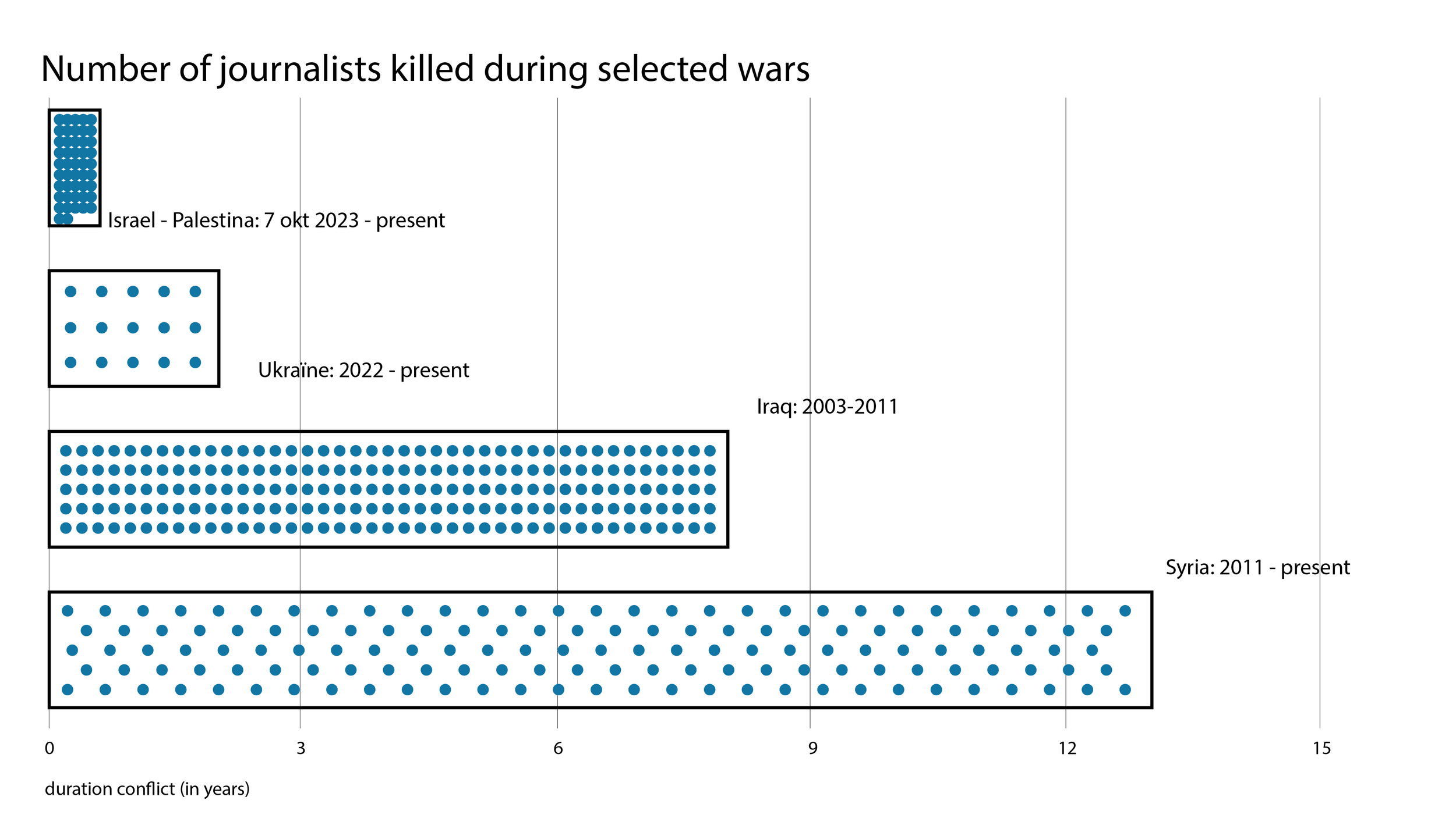
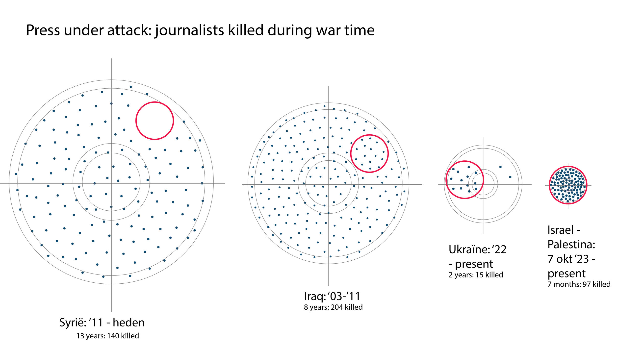
But that comparison immediately fell apart: Iraq spans 20 years, Gaza (at that time) 7 months. Raw numbers weren't the right metric, I was looking for intensity. So I rethought the visual to show both the number of fatalities and the duration of each conflict, using dots per fatality and column width for time.
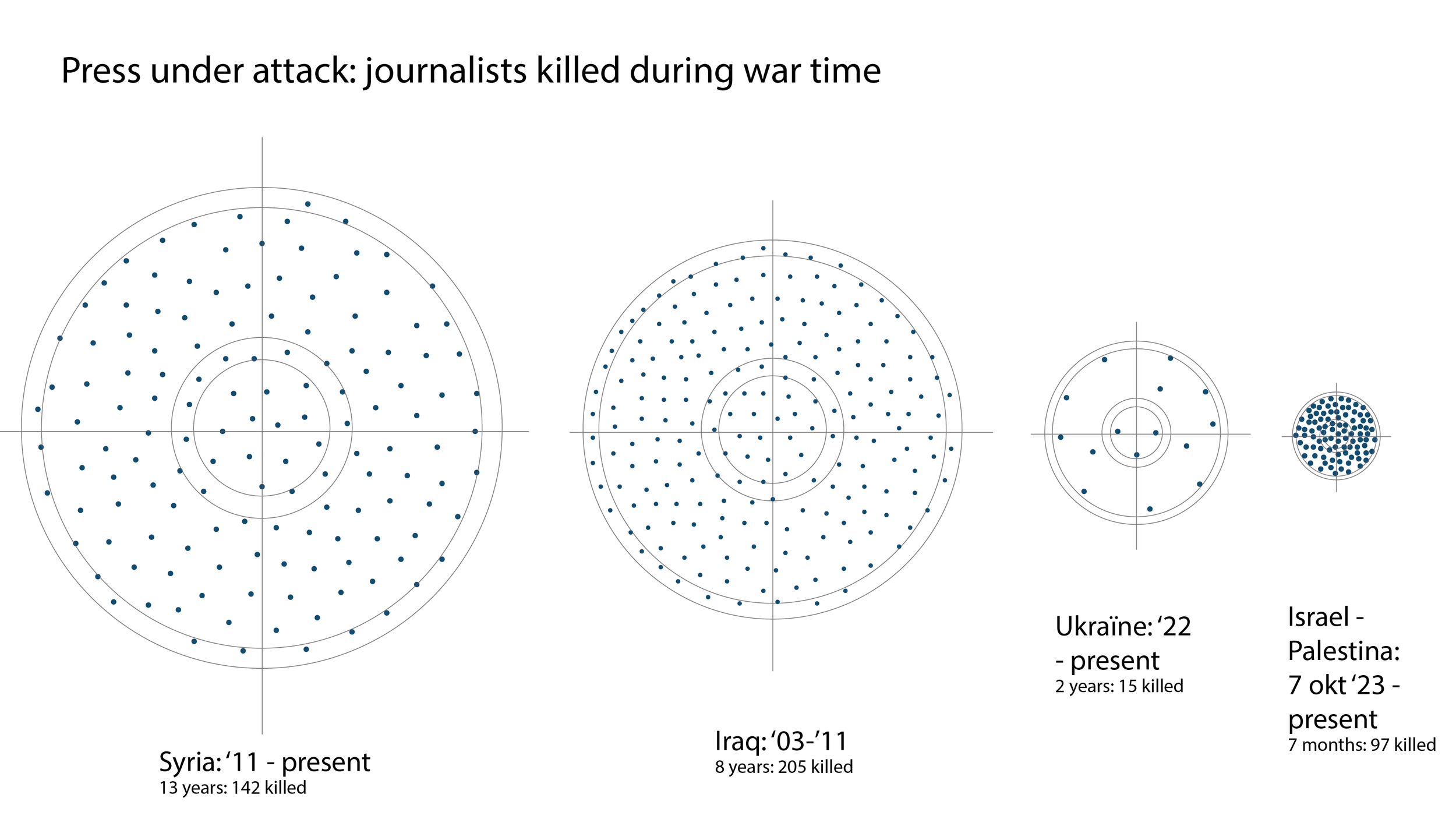
The next step was turning it into an illustration. I sketched several visual metaphors before landing on crosshairs and helmets. The crosshairs only worked as a circle, which meant switching from a bar chart to a pie chart. That came with a trade-off: duration becomes slightly harder to read precisely. But since intensity was the main point, I made the call.
That got me closer, but something still felt off. A long-running conflict like Iraq gradually loses media attention and with less attention comes less presence on the ground. Fewer journalists means fewer potential fatalities, regardless of how dangerous the conflict actually is. Ukraine and Gaza, both relatively new at the time, could naturally have had far more journalists present. More presence, more risk.
Comparing raw totals across conflicts of such different durations could be misleading. So I added a comparison with fatalities in the first 7 months of each conflict too, putting all four wars on equal footing.
Now I had the data story I was looking for. I rearranged it a little bit and from there, I added the illustration layer and translated the data visualisation into a data illustration.

final result as printed (in Dutch) in NRC, early 2024