Who wins the Nobel Prize?
published in NRC, October 2025
Sometimes stories arrive sideways. I occasionally teach data visualisation to journalists, and while looking for a fun dataset for a workshop, I stumbled upon a dataset on Nobel Prize laureates. That evening I never finished preparing the workshop. Instead I sent a pitch to NRC.
The pitch was built around a single question with multiple angles: gender, geography, family wealth, academic networks. Rather than one sprawling graphic, I proposed a collection of smaller ones, each answering a subquestion of who actually wins. NRC agreed. This was a separate pitch to the science desk, distinct from the biweekly column I produce for NRC's op-ed pages. It had a different approach: not opinion-led but research-driven.
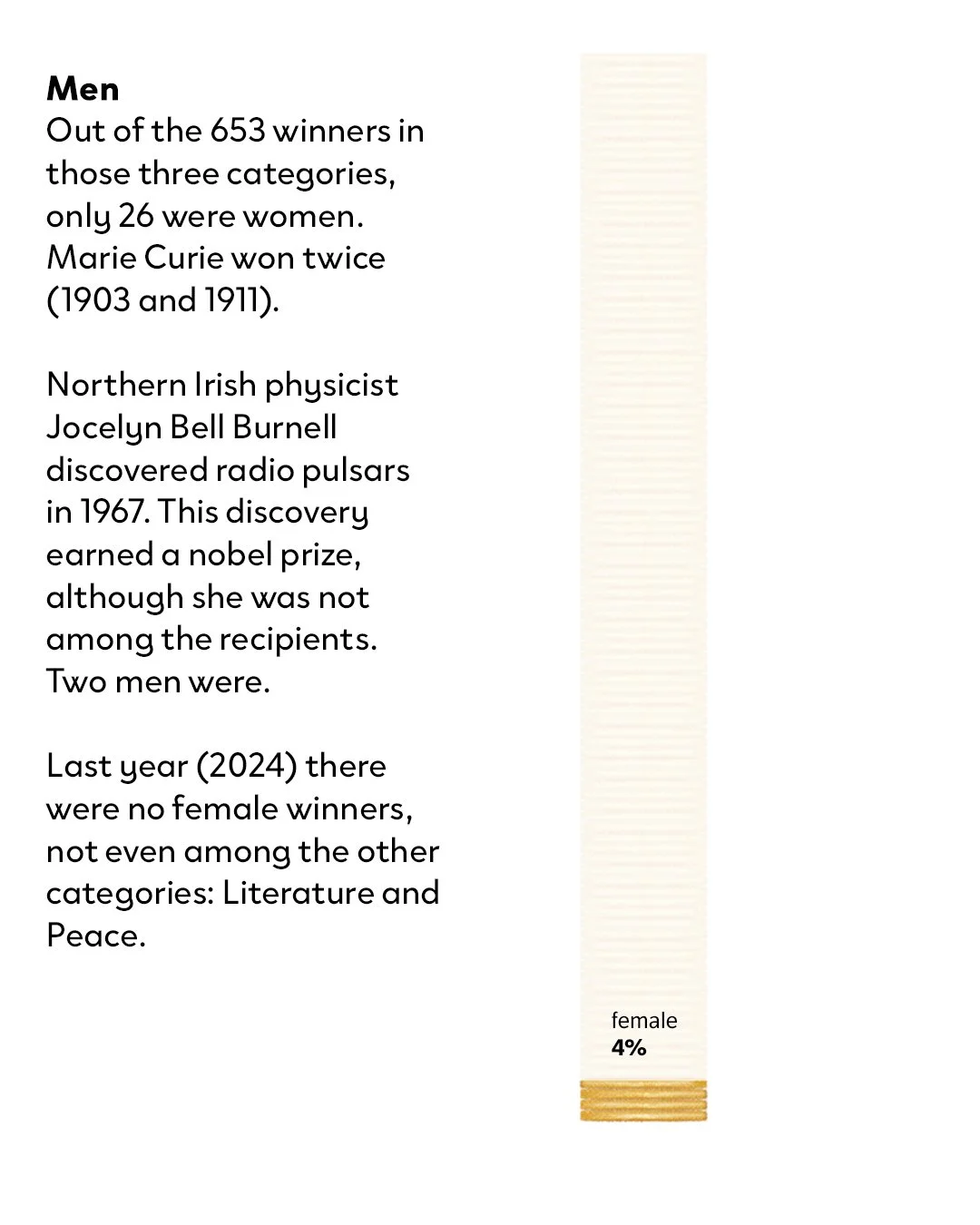
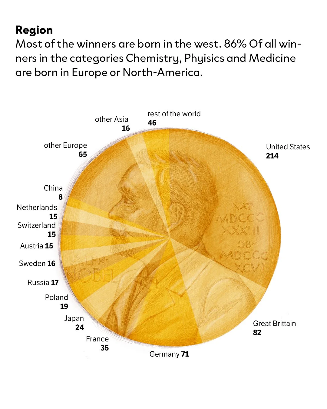
The gender and geography data confirmed what you'd expect, but the extent of it is still striking.
That raised harder questions: are Western scientists simply better resourced? Are laureates more likely to nominate people within their own network? I went looking for research and found two papers that shaped the rest of the project.
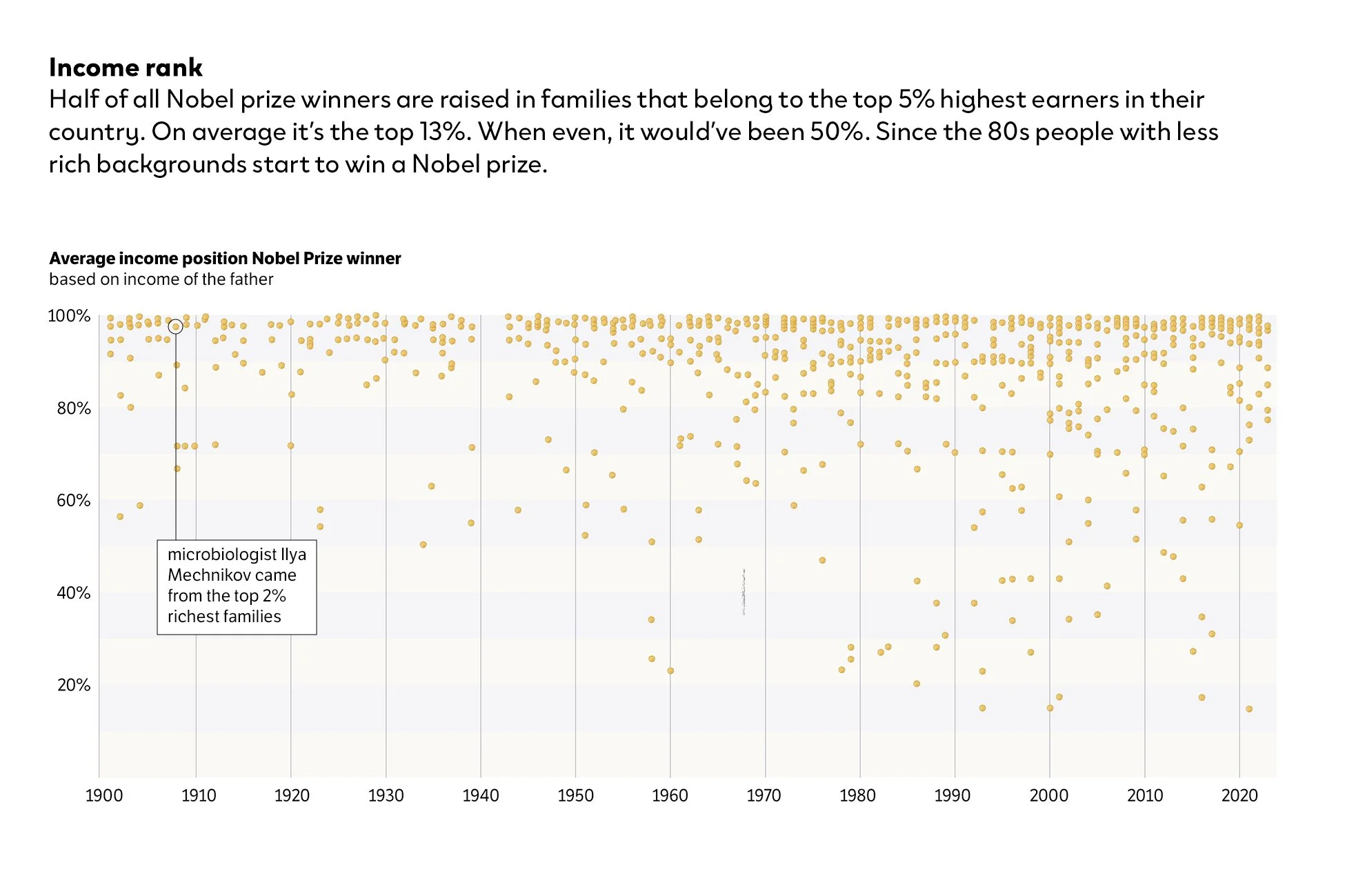
The first paper showed that 50% of all Nobel Prize winners grew up in families in the top 5% of earners in their country. I verified the data and methodology applied with him to my specific selection of prizes.
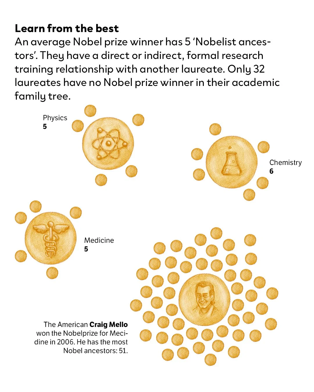
The second paper mapped the academic family trees of laureates and found that on average a winner has five Nobel Prize 'ancestors': people with whom they share a direct or indirect formal training relationship. Only 32 laureates in the entire history of the prize have no connection to another winner at all. Both findings reframed the question from "who is the brightest?" to "who gets the chance to become the brightest?"
Once the data was gathered, the first design decision was which graphics could carry illustration and which couldn't. I set a simple rule: if adding a visual layer made the data harder to read, I'd leave it as a clean graph. If the data was simple enough to hold it, I'd push toward illustration, because a data illustration lands differently than a chart. It pulls the reader in before they've processed the numbers.
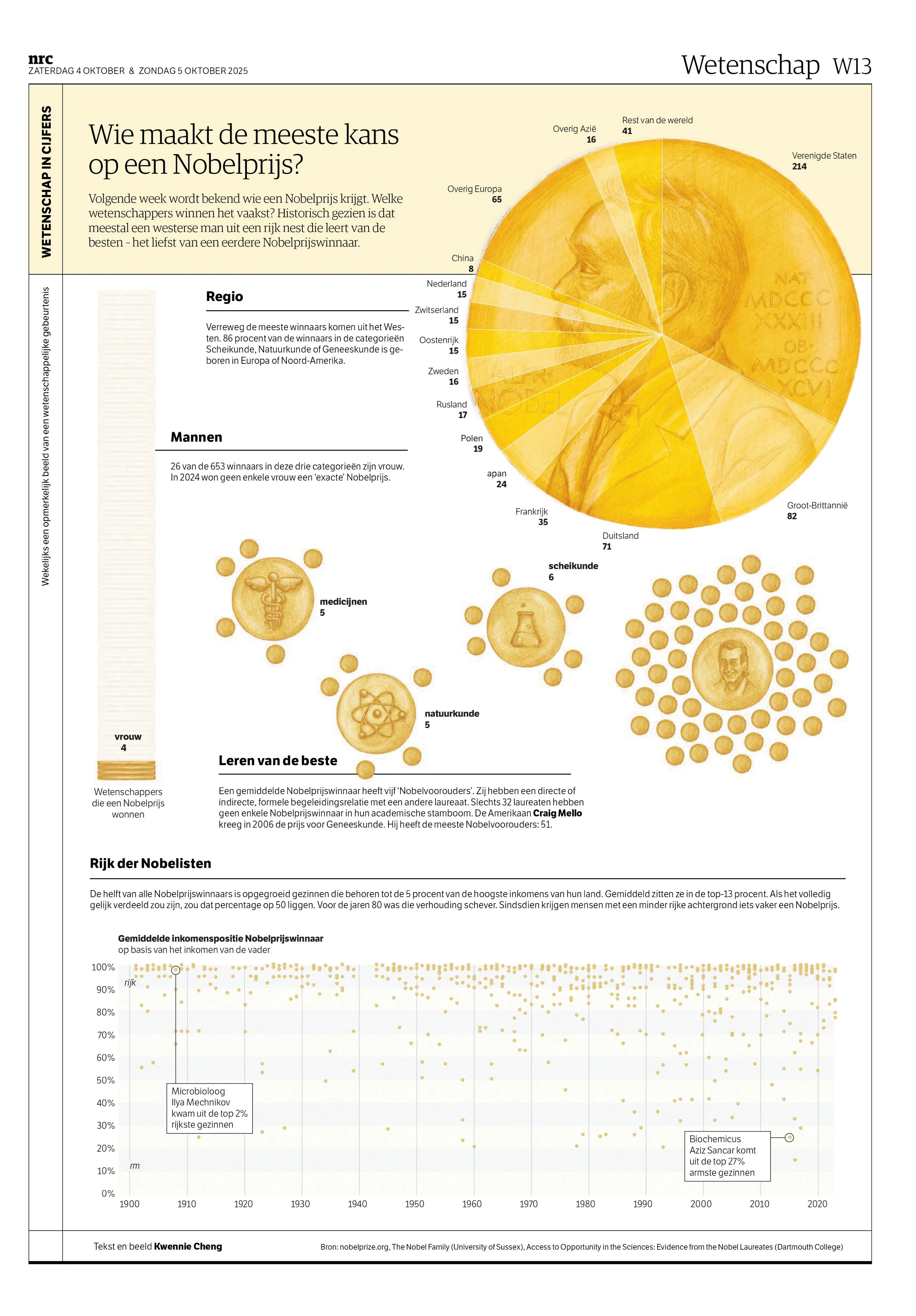
Some calls were obvious. The Nobel Prize medal is a circle, so the regional data became a coin: the visual metaphor was already there. Gender data is simple enough to carry more weight: I visualised it as stacked coins, building a visual language consistent across the page. The network graphs could have been a bar chart, but with the coins in mind I made them more illustration-focused. I had enough breathing room to add symbols for each scientific field, and one laureate (the winner with 50 Nobel Prize ancestors) was striking enough to illustrate directly.
The income graph was a different story. The data was too layered, too dense. I made the call early: keep it clean, no illustration. And I did. Except I changed every data point into a tiny illustrated coin. Small enough that the readability stays intact, personal enough that it still feels like mine. I’m pretty sure most readers won't notice. I did this last bit just for me.